USAA Automatic Payment Plan
iOS and Android product design for USAA's app. Product is slotted for launch Fall 2025, contents shown here are of the experience testing process and not the final designs.
Once the product is launched I will update to include final designs.
The Challenge
USAA had been long-overdue on adding the ability to set up and manage Automatic Payment Plans to their native app. The goal was to take the requirements from the old web-based system, note user feedback and pain points, and create a user-friendly experience for USAA members to easily set up and manage their autopay from within the app. Using these new forms, the iOS and Android experiences could be identical, unlike past projects like the In-App Single Bill Pay experience.
My Role
As the lead designer on the project, I worked with our business stakeholders to create several versions of the experience using USAA's Reveille Design System (RDS), AB Tested them against each other using Userzoom. Then we finalized the decided direction, and worked with developers to tweak the designs around back-end limitations and additional requirements from business.
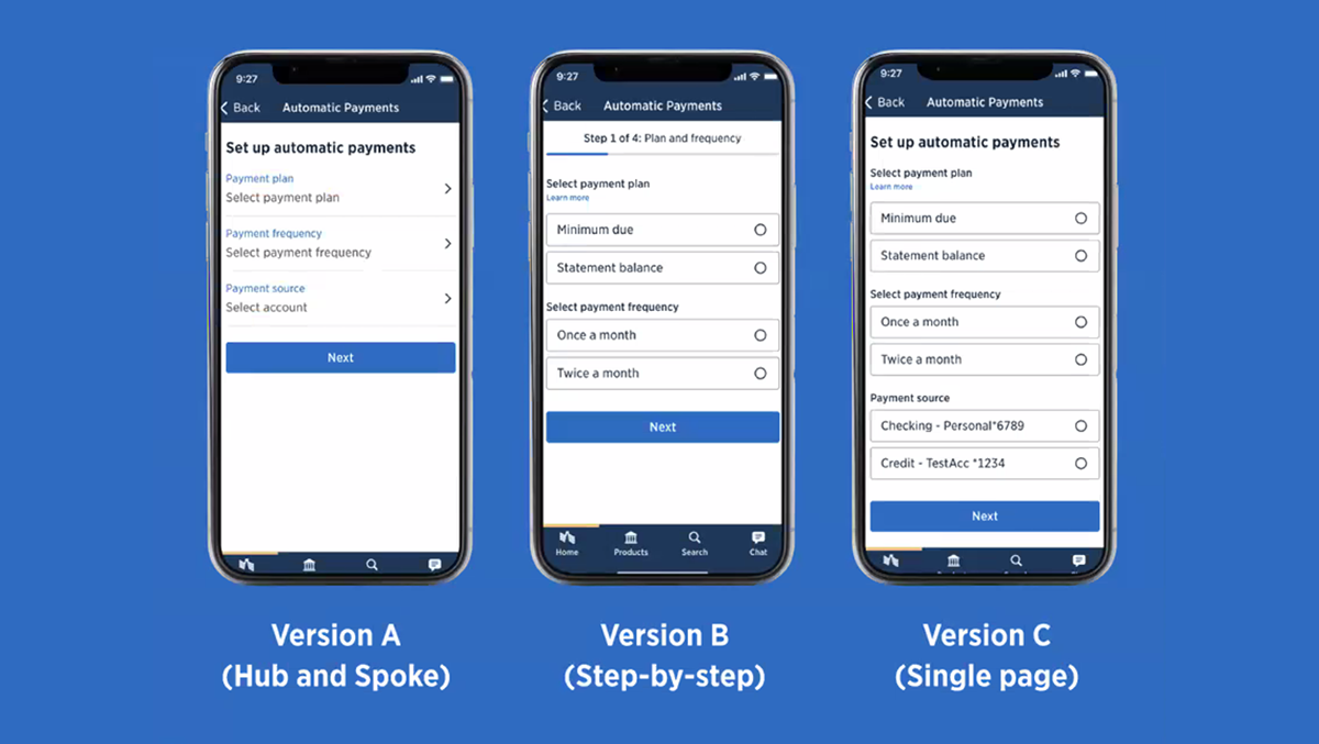
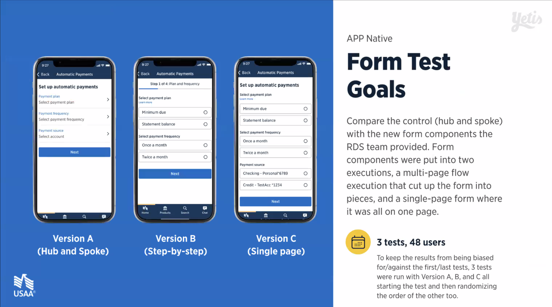
Version Design and Testing
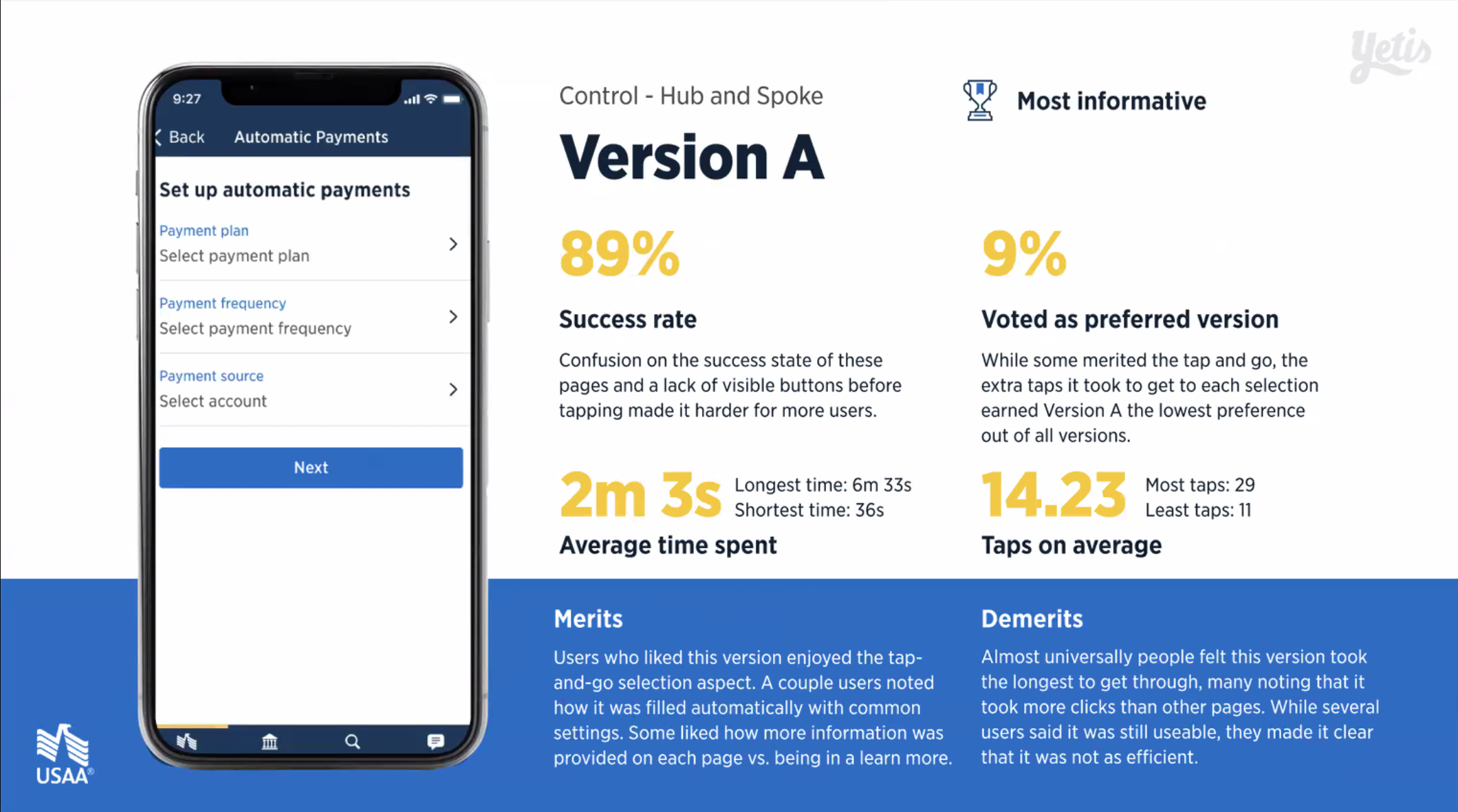
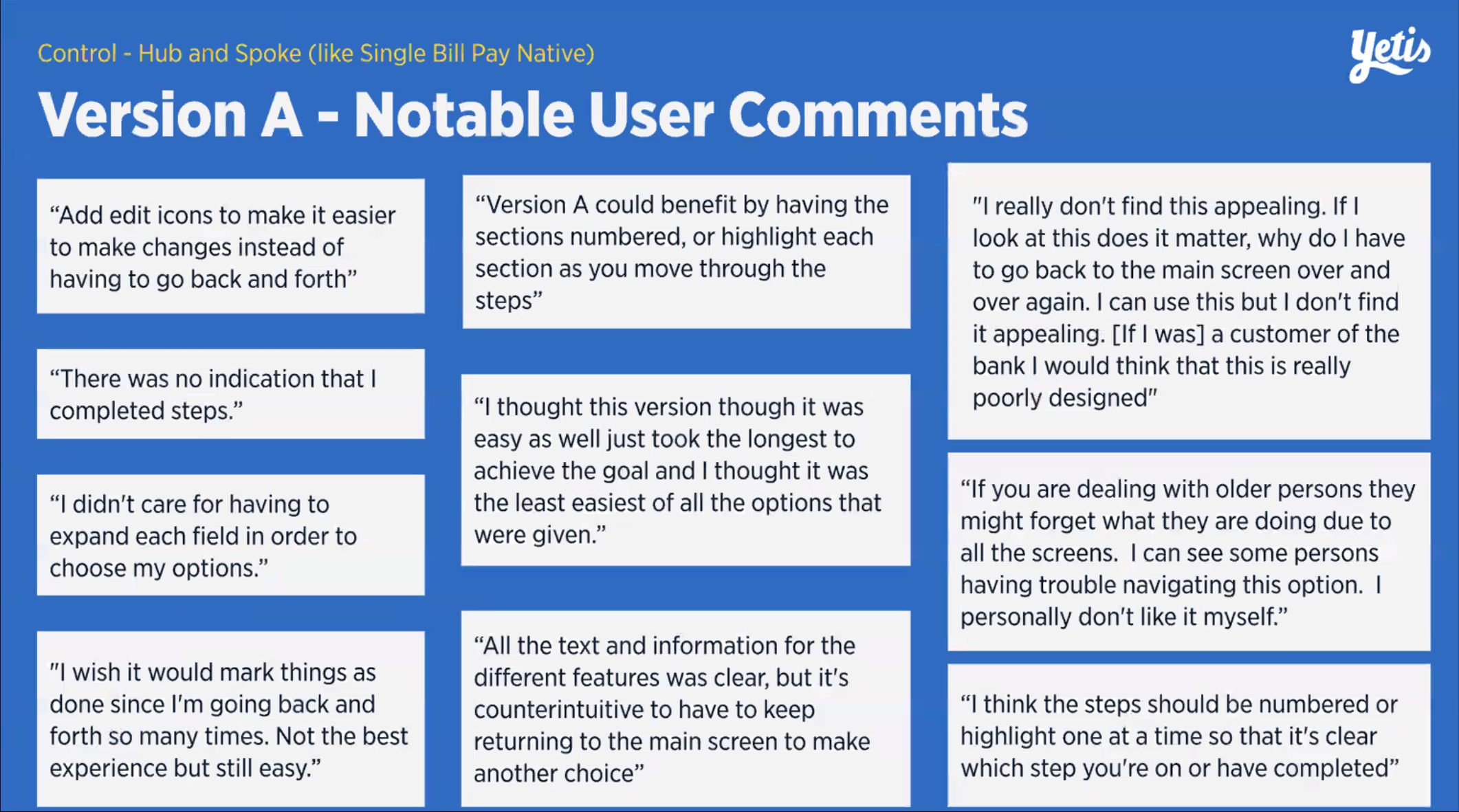
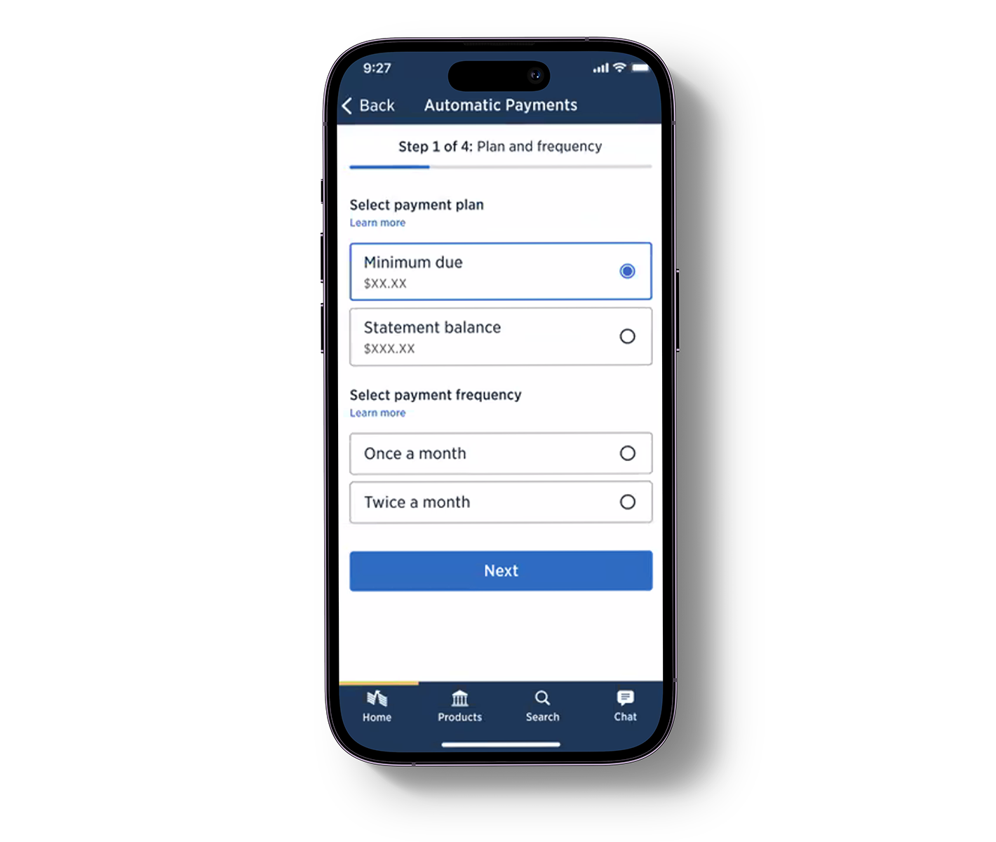
USAA's design system had been developing an update to their forms, and my team was lucky enough to get our hands on it in advance. The older form components, seen in Version A, had some experience issues, but had precedent from previous use. Taking this opportunity to use the new components, I put together several versions of the flow, and tested them against each other using Figma's prototyping tools and Userzoom. You can see the results of the tests in the presentation below.
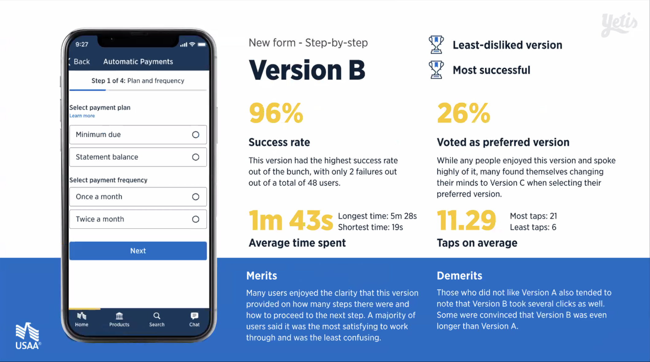
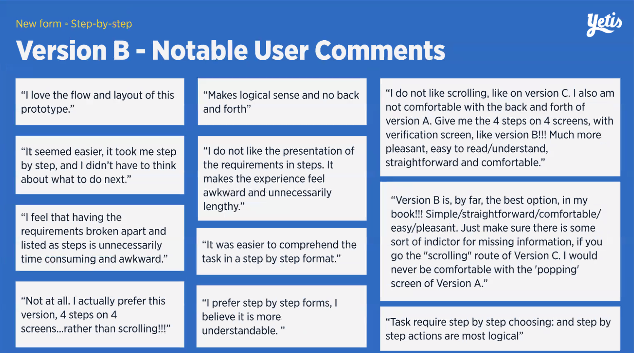
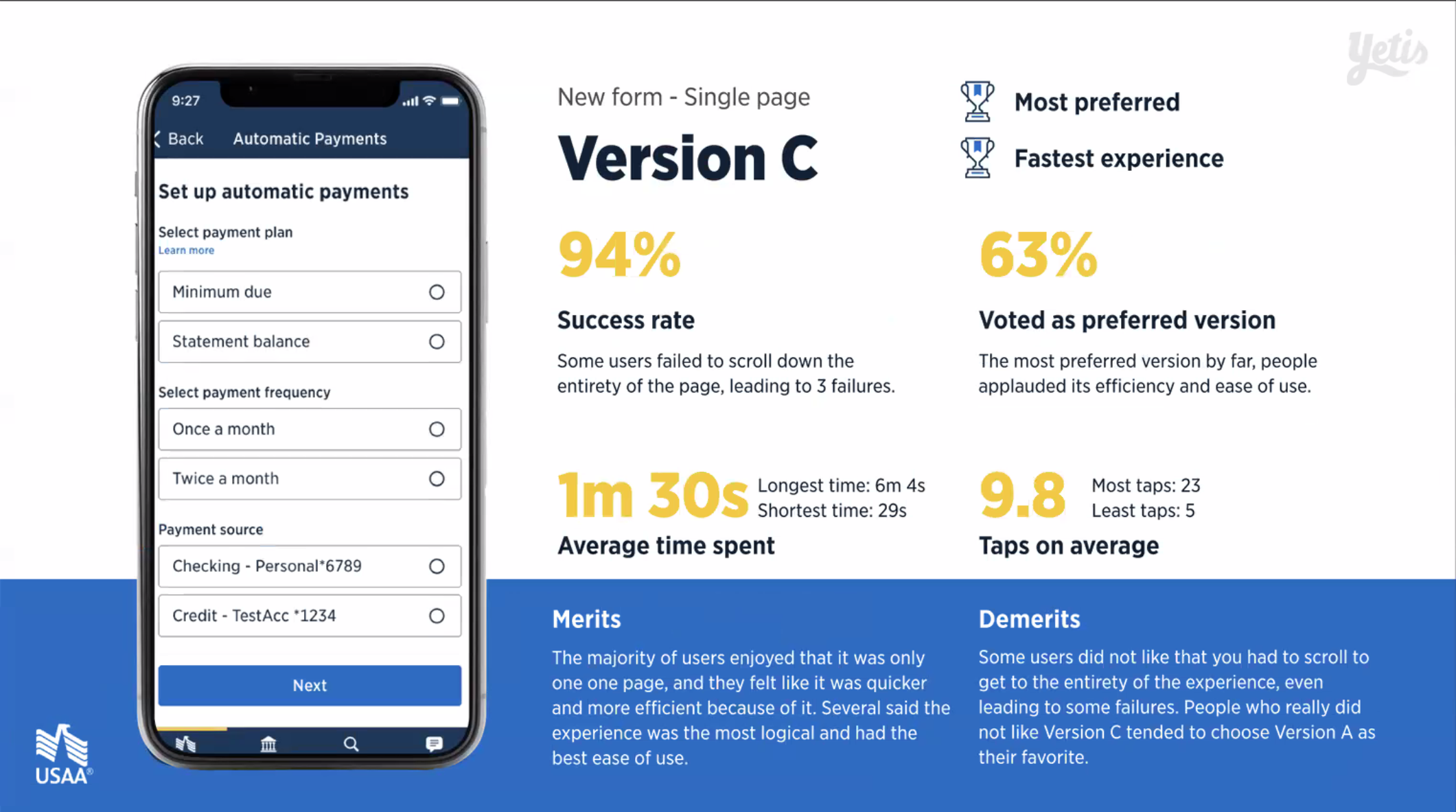
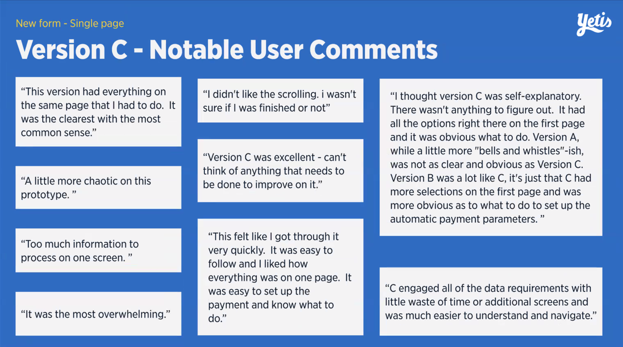
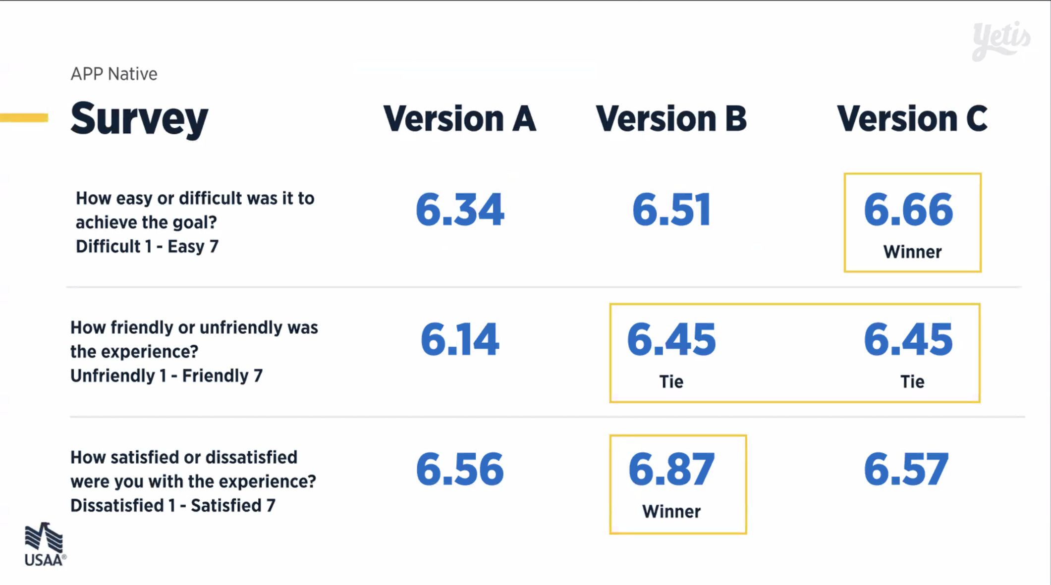
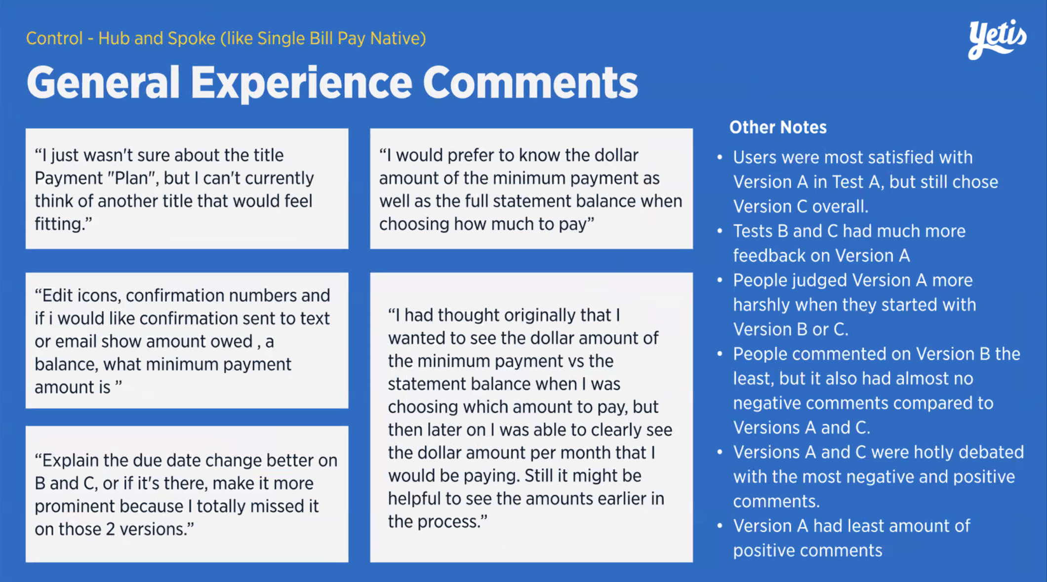
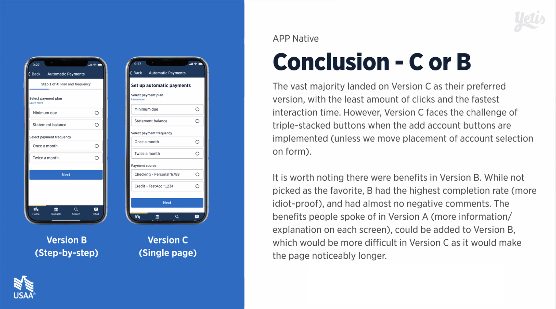
Test Winner
After discussing with our business stakeholders and refining the designs, we landed on using Version B with additional descriptors similar to what was used in Version A. This allowed for all the benefits of Version A with none of the confusion, the ease of use of the new forms used in Versions B and C, and the conciseness of pages in Version B's overall easiest to use experience, for standard sighted and visually impaired users.
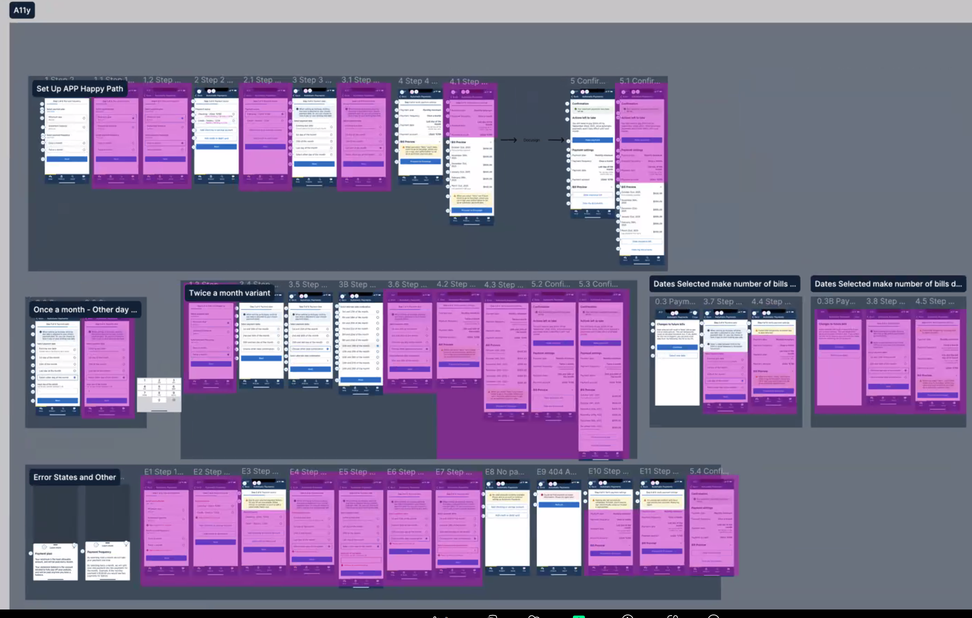
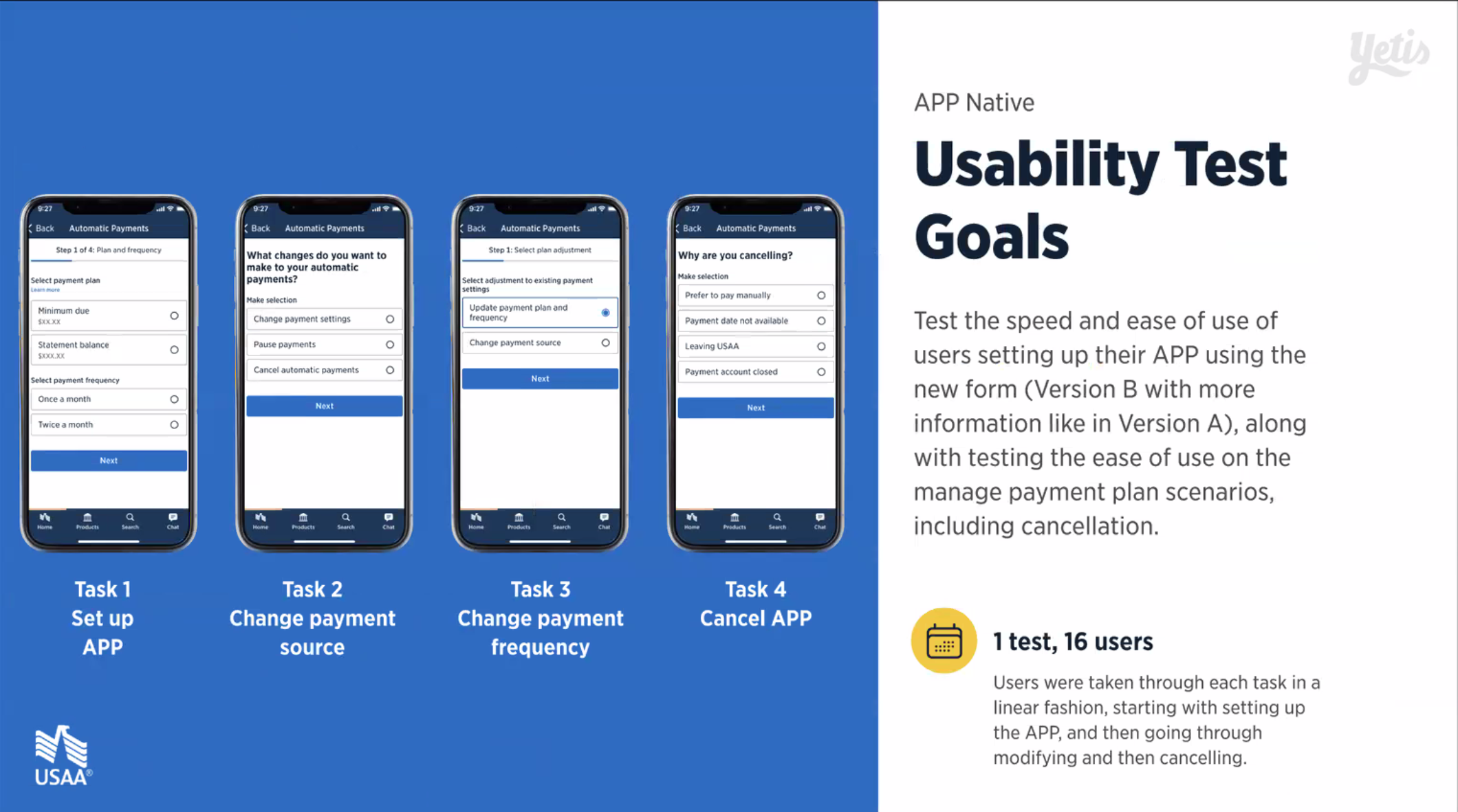
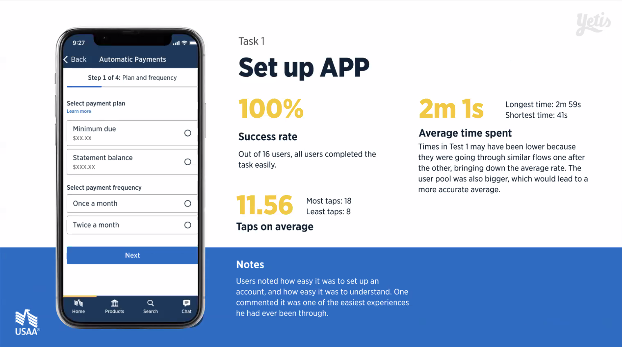
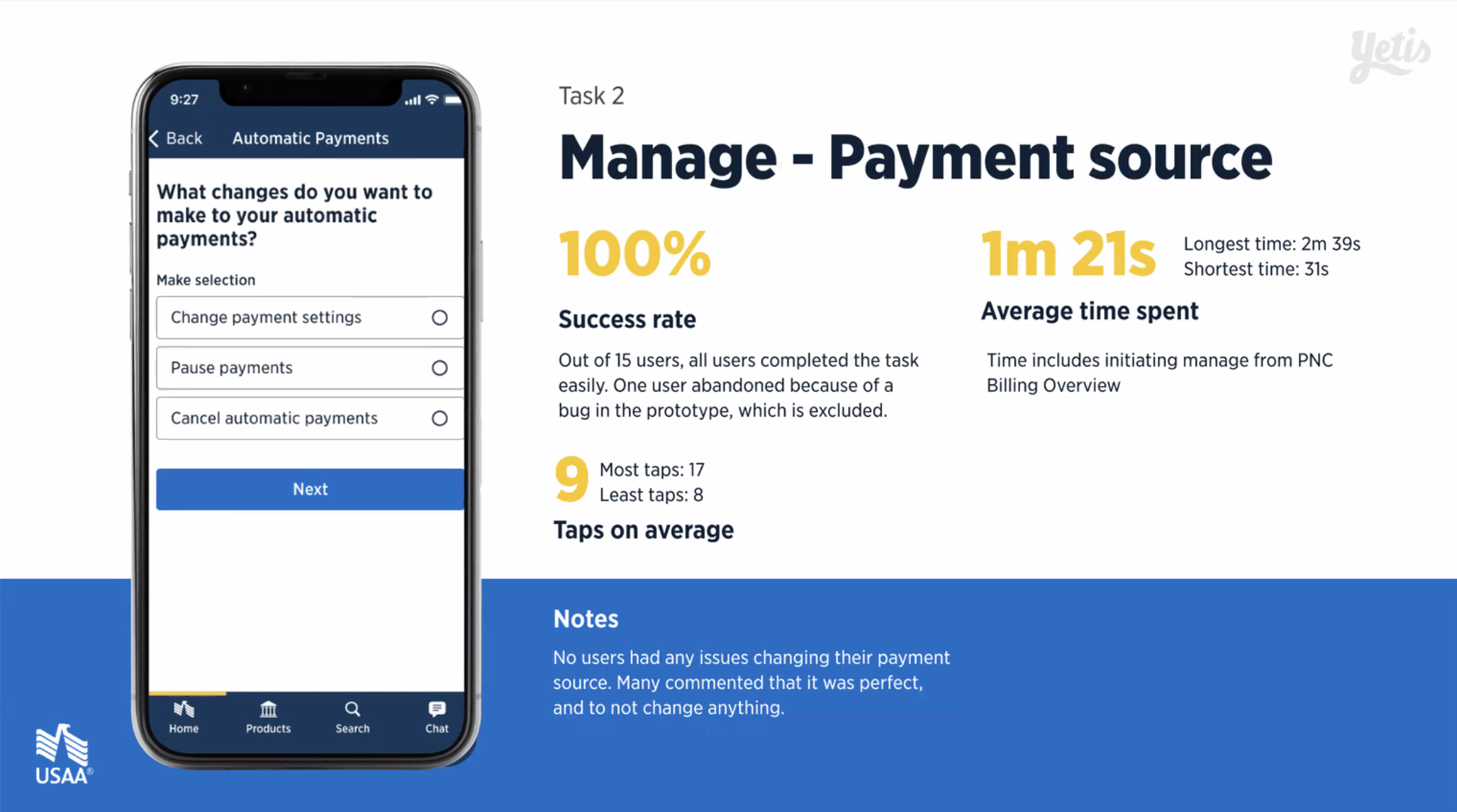
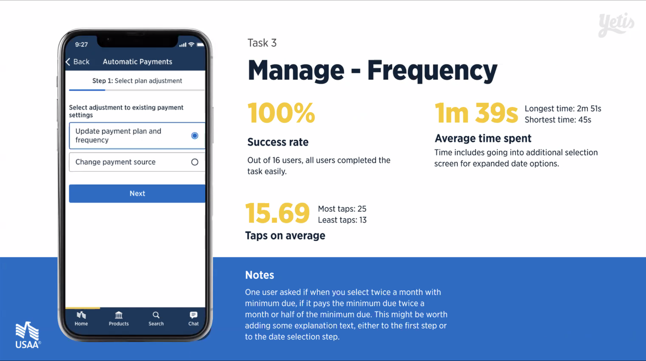
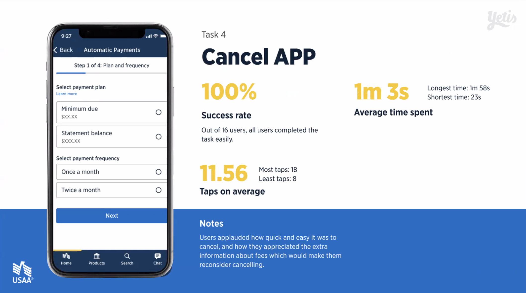
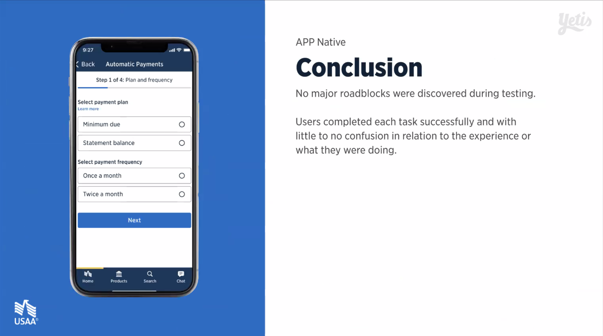
Final Design Useability Tests
Once direction was finalized, all parts of the experience were ran through a useability test. Any other needed enhancements before it was put through legal and design review were caught here. See presentation below.
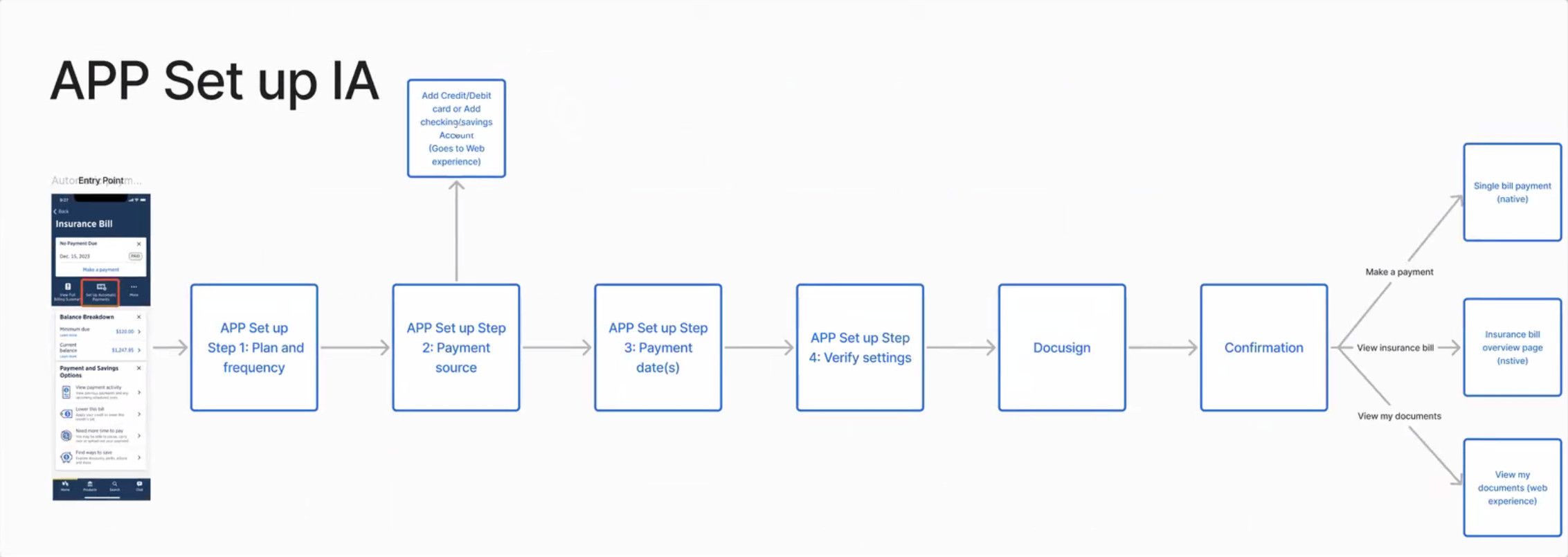
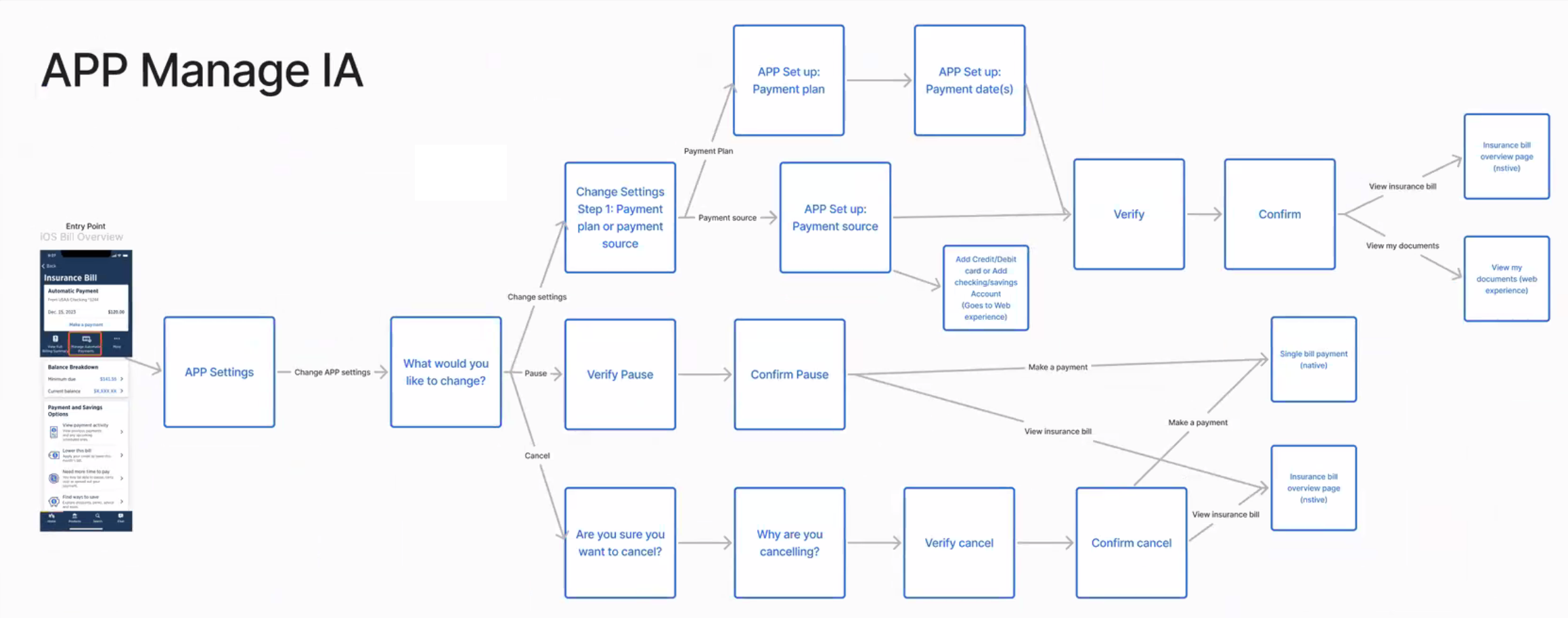
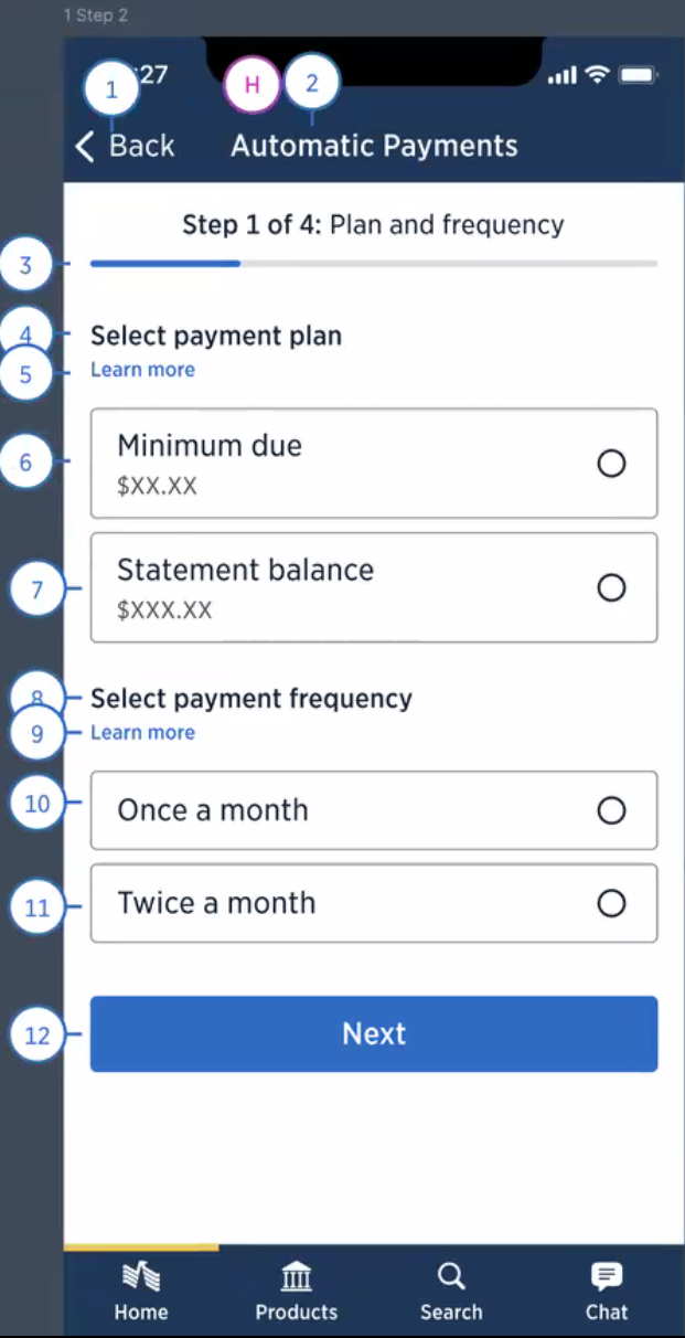
Information Architecture & Accessibility Markup
USAA's consumer base is comprised entirely up of Veterans and their family members. Because of this, USAA has a higher than average percentage of older and visually impaired users, which requires USAA to have the highest standards when it comes to accessibility, with designers and accessibility specialists working together to create the best experience. Designers like myself create the accessibility markup, and then review with the accessibilty team for enhancements or fixes. Once finalized, the developers use this markup to ehance the experience for those users.